Breakdown
Client Brief
Your challenge is to present a redesigned Chess.com that is visually delightful, brand familiar for the millions of exisiting players, and creates a friendly, rich, and intuitive user experience for all types of players.
Style: our current designs feature elements of flat and material design with more muted colors. newer design trends are brightening back up, adding back depth, texture, and lighting. What should Chess.com look like in 2021?
UX: Choose web or mobile home screen. How do you present to all types of users the ability to experience our primary actions (play, puzzles, lessons), while also offering secondary features like Tournaments, Drills, and Puzzle Battles, but also have access to our awesome content, shows, events, and articles while also having layers of social elements, friends, clubs, leaderboards, stats, etc. There are lot of layers to this onion! How would you organize them?
Deliverables
Hi-fi wireframe
Situation
This was a design competition that spanned 2 weeks and was a solo project.
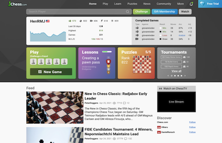
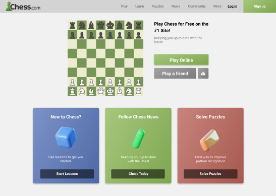
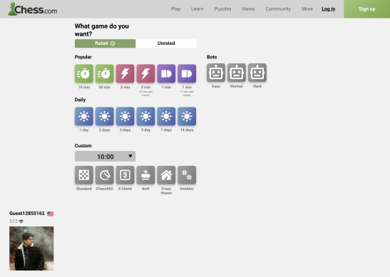
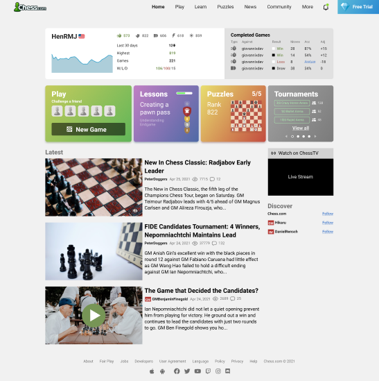
Evaluating original design
Current design has related elements, split throughout the page
A lot of content is cut below the fold
Lo-fi Iterations
I categorized users by the actions that could be taken on the site. I kept the idea of it being visually simple while still having all the features that a power user would use, in mind. Assuming that power users would be the most active and therefore an important customer base for the business.
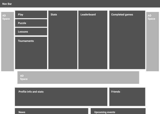
The social focused player
Prioritized the social aspects of chess.com (friends, leaderboards, etc). These features take precedence in the above the fold UI, sharing their space with articles and news briefings to help build a sense of community on the site.
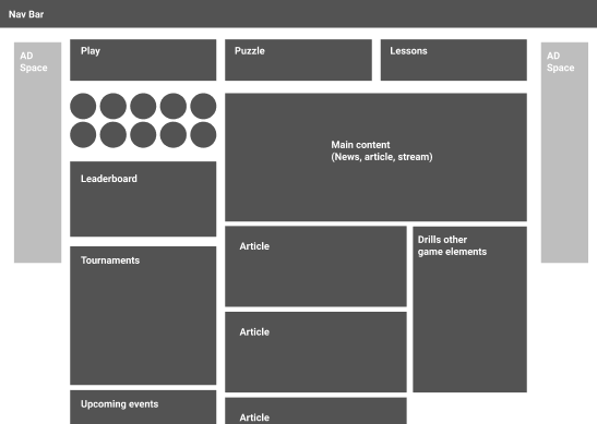
The stats focused player
Focuses on numbers and statistics of in-game information to incentivize play and competition. Use of ad space was used to separate other elements like articles and events to keep the users attention on their own information.
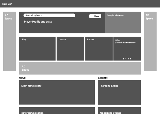
The hybrid
Built with the two extremes combined to create a more balanced and approachable experience. Some statistical information on top exists, while allowing for more articles and events to show above the fold. The main 3 actions of play, lessons, and puzzles take up a majority of the screen to draw the user towards those actions.
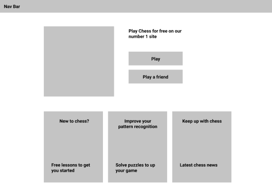
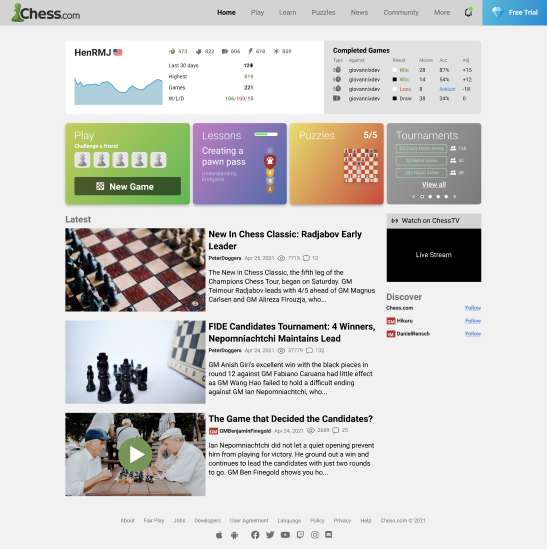
Landing page
I wanted the landing page to be more consise and separate the different actons you can do on the site clearer.
My thought process for adding the “Play a friend” button was to onboard 2 people on to the site quicker. Where both players at the end of the match would be asked to create an account to save their user data.
Hi-fi screens
Color choices
The choices for the colors of each actions (lessons, news, puzzles) were taken from the hues chess.com already use. Increasing the saturation and made them more prominent to establish a strong connection from a users first interaction on the site.
Additions and consolidations
Added a notification icon. The original design had the home button act as both notification and navigation, causing confusion.
Grouped similar elements, while keeping the depth of each element. In some cases I was able to flesh out functionality for certain elements. For example, I was able to add more statistical player data for multiple modes of play.
The play button displays a profile image of friend to challenge friends without navigating from the homes screen.
In lessons, I added a progress bar to gamify and incentivize completion of the course.
I added a section for the daily puzzle and a counter for free users to track their daily puzzle limits.
Explorations for different screens
I took a break from iterating on hifi screens, to see how the design could be translated to other screen.
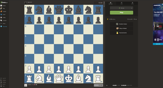
Current game page
The biggest room for improvement I found was separating features to different screens. Challenges, game options, custom game configuration, and player search were all found on one side bar
Similar mistakes
My first iteration was focused on looks without thinking about usability. The layout expands the chessboard and moves the navbar to the top leaving more room for player data.
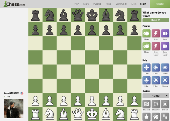
Separating actions
After thinking thinking about the issue, I created this screen to focus on which mode of play you wanted.
This also allows to show more niche options of play and add a bots sections to justify the elmination of the “play a computer” button on the home screen.
Final round of hi-fi designs
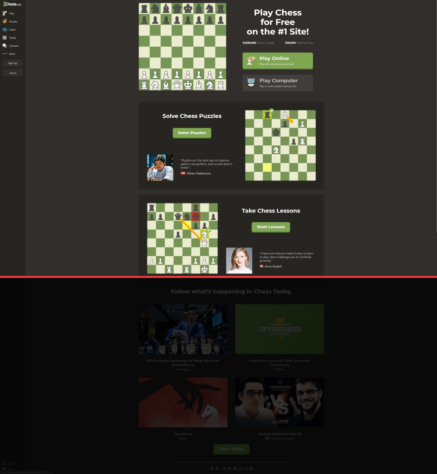
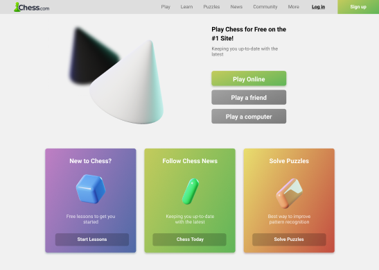
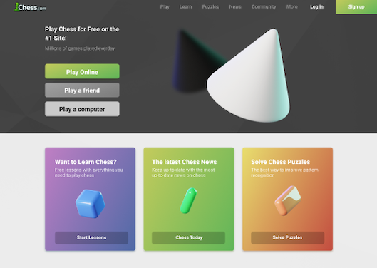
Evolution of landing page
From the lo-fi mockups I added a robot icon to add keep the “Play a computer” option from the original landing page.

From feedback, I lowered the opacity of the buttons (Start Lessons, Chess Today, Solve Puzzles) and replaced the robot icon because it might not be understood by all users.
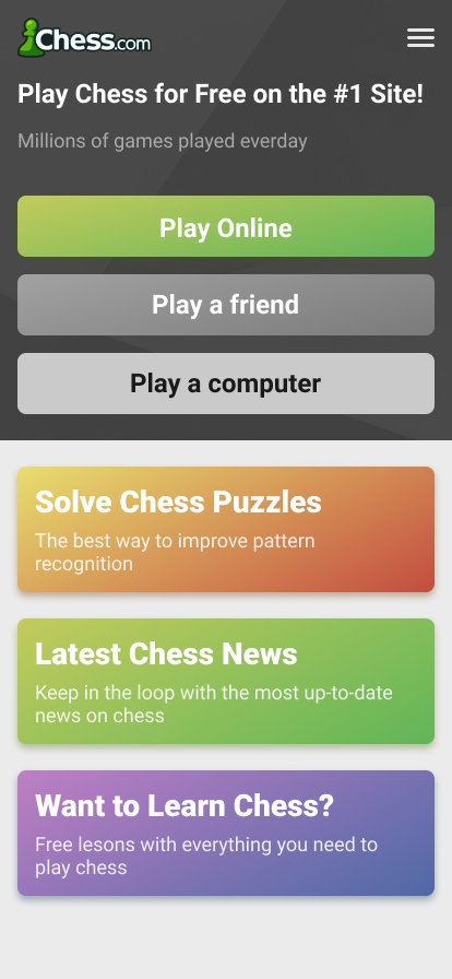
I replaced the chessboard with a representation of chess. The black and white cones representative of the pawns.
I changed the colors to a more drastic gradient to bring more attention and make it look less flat.
Added a gray background to push the idea of black and white fighting against each other.
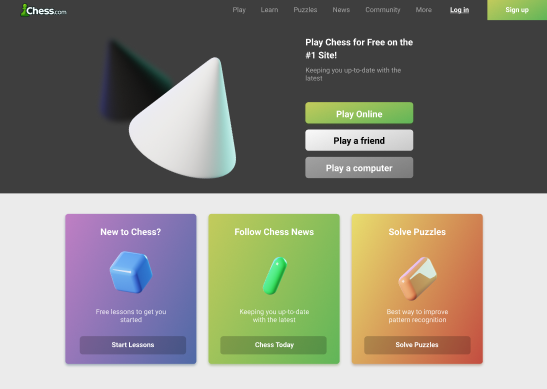
Moved the buttons and text to the left to fully utilize the width of the page and give more space for black and white pawn. I added a subtle geometry background to the gray background to make it more visually interesting.

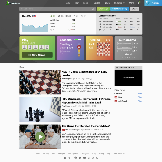
Evolution of home page
This is the first hi-fi iteration from lo-fi
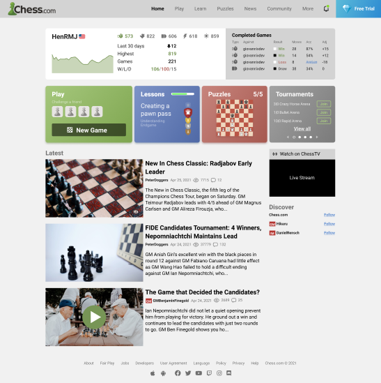
I experimented with the header font making it larger and lowering the weight.
I also changed the color of the chart to blue to keep the design from looking too monochromatic. Blue is a common color used to represent statistical data.
I played around with the position of the chessboard on the puzzle button, taking up most of the bottom portion of the button felt like a poor utilization of the space.

I moved around the board to see to what extremes I could push it without it being useless.
I changed the names to be the buttons in the tournaments section, so users could have a larger space to click to help prevent accidental clicking.

The accessability of the titles felt like an issue. I had slight trouble reading them so I enlarged them so they would be more accessible for people with worse vision.
I removed the nav bar background and I also added a ranking score to the left side of the puzzle for users to get a quick look at what difficult of puzzle they would be completing.
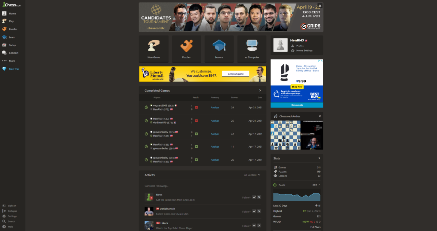
Final designs
Two things I would want to change is to look around the IA of the site and consolidate the nav bar into something more managable. Chess.com has a lot of features that are hidden and I would want to bring some of those to the forefront of the site.
I also feel the accessability of the cards could be addressed. They look good but I have concerns that some would have trouble reading them.
I changed the tournament buttons to white because I didn’t feel like they need to bring more attention. They aren’t part of the main actions that chess.com wanted ot push. I also have the same concerns of accessability as the landing page.
I would also like to look at statistics of the most common actions done by users when look up other users and adjusted the search bar buttons to that. I would want the player profile element to automatically change to reflect the player’s information that’s being searched.
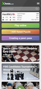
Translating to mobile
Home page
The home page’s player profile was one of the more difficult items to translate. The spacing between element and icon for each mode of play were too close to distinguish which number correlated to which icon.
I added a bit of color to help separate each mode. The idea of colors was always intended in the desktop design but as an indicator to show which stat you were looking at, at the current moment.
Landing page
This page is filled with interactable elements throughout the screen. I was thinking of eliminating a few buttons to make the chances of accidental presses less likely. Ultimately, I decided against it. I would want to see how this page performs live to see if any changes would need to be made to it.
Conclusion
This was one of the only projects that i’ve done without any research or testing behind it. I made a lot of guesses and I feel like the design suffered from it. I really think this project highlighted the importance of research.
I also ended up not winning the competition and only got 9 months of their premium membership for my work. A value of 79 dollars.