Breakdown
Problem
This project is a greenfield project for visual creators to share
feedback.
Goals included:
Making the product accessible
Designing at different breakpoints
Making the product fun
Situation
I worked fully remote over 48 hours in 8 weeks. I worked solo for the last six weeks of the project.
Deliverables
- Personas
- Journey Map
- User Flows
- Lo-fi Wireframes
- Lo-fi Prototype
- Hi-fi Prototype
- Hi-fi Wireframes
Discovery Phase
We developed a risk matrix to prioritize our research questions. Our questions focused on the viability of our project. Others focused on how people receive and give feedback, and project habits.
How many projects does an individual works on at a single time?
What kind of feedback do our users value?
Is this product something our users want?
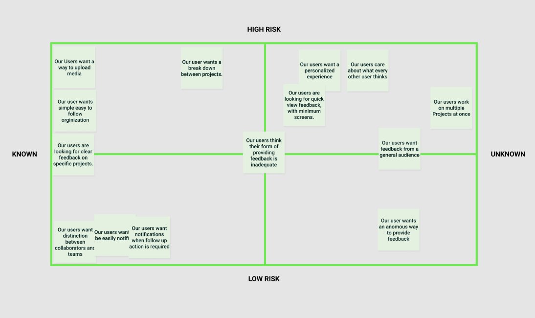 Risk matrix to evaluate how to move forward with our research
Competitive Research
Our competitors
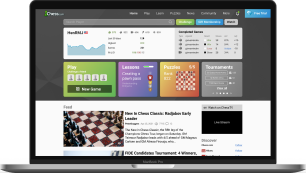
Dribbble, Art Station, Behance all focus on sharing visual content with a secondary effort in giving comments. We looked at Trello, Slack, and Monday to check their efficacy on communication.
Key Insight
- Contain elements of social media
- No strong focus on incentivizing feedback
- Often used as a hosting platform for projects
- Sites focus heavily on the professional market


Surveys
Questions
Our questions centered around user tech habits and feedback interactions. We framed the questions to work in any career field to allow a broader range of responses.
We limited our questions types to multiple-choice or scale responses to minimize text responses. This made it easier to digest and categorize the survey.
Reach and outcomes
After sharing the survey on social media, slack and discord channels, and friends, we received 17 responses, with 11 singing up for user interviews.
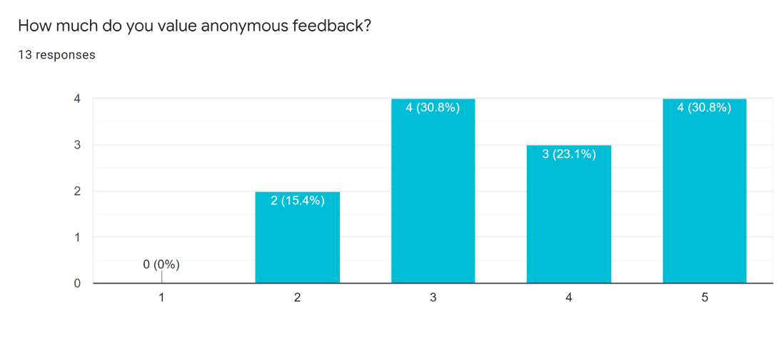
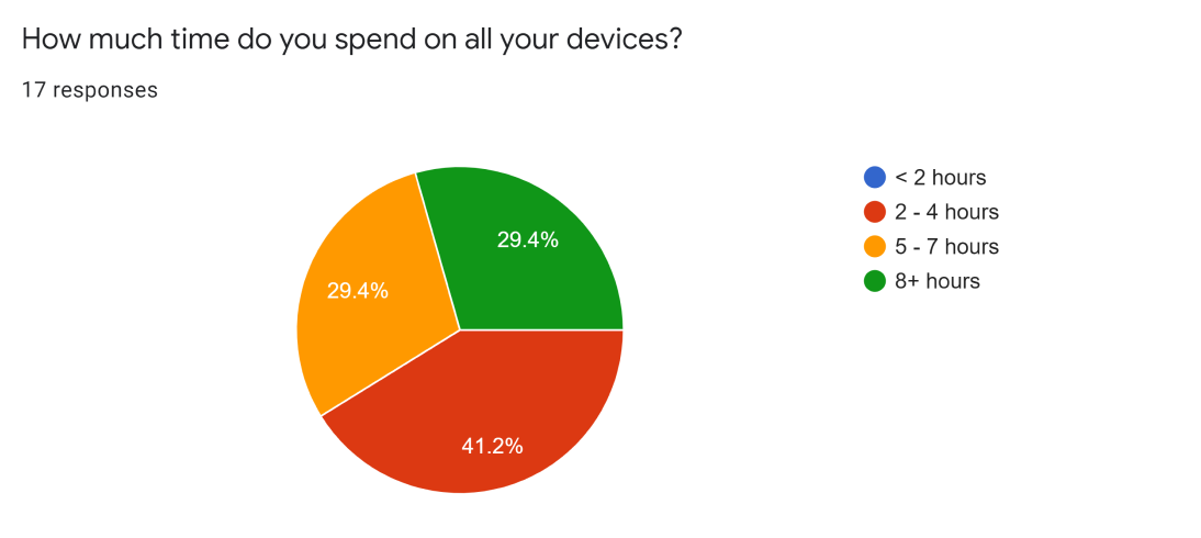 Example of questions in survey
User Interviews
Questions
We wanted to understand what made feedback good and bad. Our questions dug into how feedback made people feel and what aspects made them feel that way.
Process
Our interviews were conversational, allowing us to dive deeper into aspects of the question.
Our initial participants didn't accurately reflect our userbase. We conducted another round of interviews to capture more visual creatives. UX designers and artists.
- People felt there is a lack of feedback
- People don’t like giving feedback
- The source of the feedback is very important
- Artist don’t like feedback in general
Key Insight
Defining our users
Each color represents a participant, with each takeaway on a sticky note. We crafted an affinity map and found similarities between all our interviewees.
An example is that people feel there's always a lack of feedback.
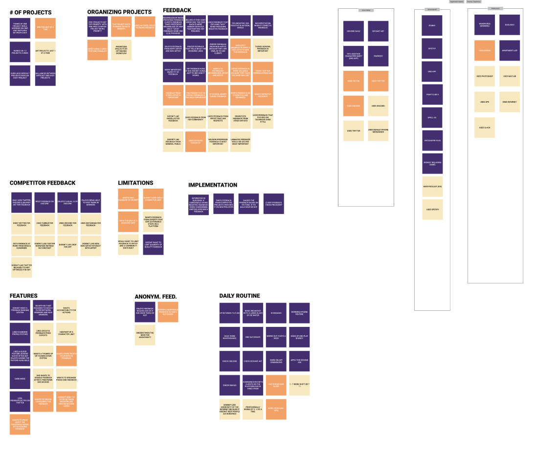 Affinity map of second round of interviews
Persona
The persona guided us with design decisions. It helped with the creation of the journey map. The journey map itself wasn’t as useful since the project was only theoretical. Our persona used aspects like common apps to keep our design familiar with our users.
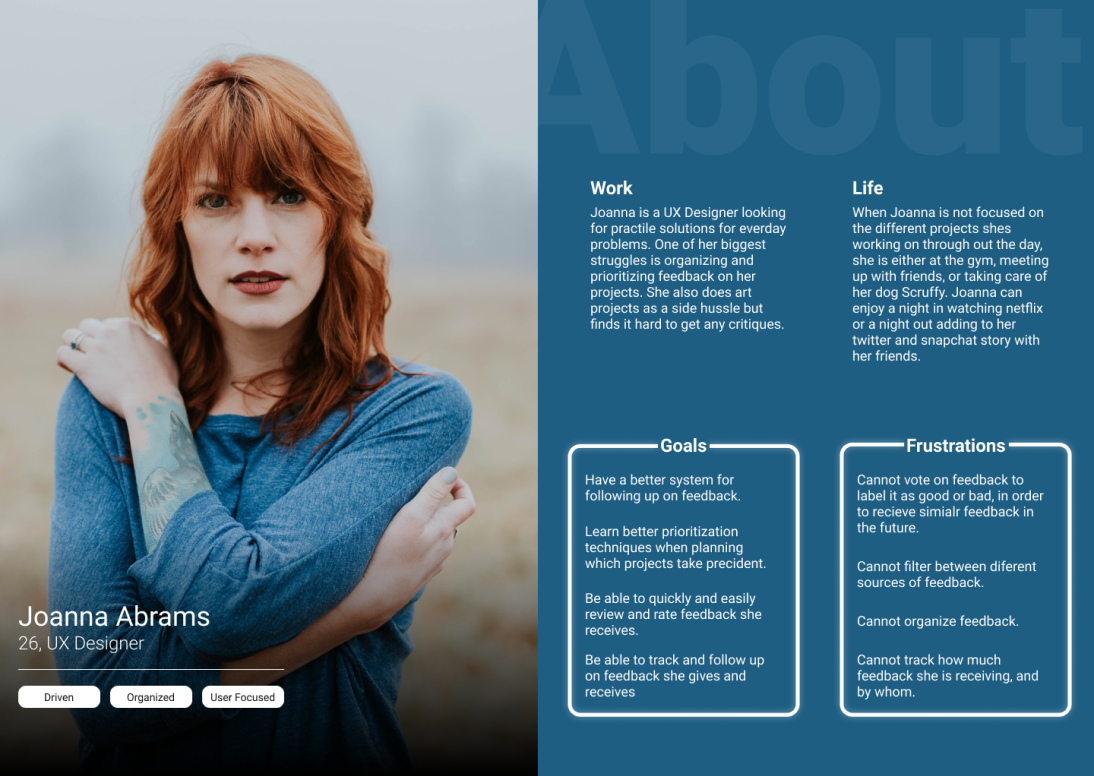 Persona of user looking for feedback
User flow
While we were figuring out our users we began to think about our flows. How submitting a project would look is something we focused heavily on.
We focused on ways that users could easily edit preferences while keeping the flow simple. At this point, we wanted to keep all the actions on one page. This helped churn ideas of how the UI could look so we wouldn’t be going into lo-fi design blind.
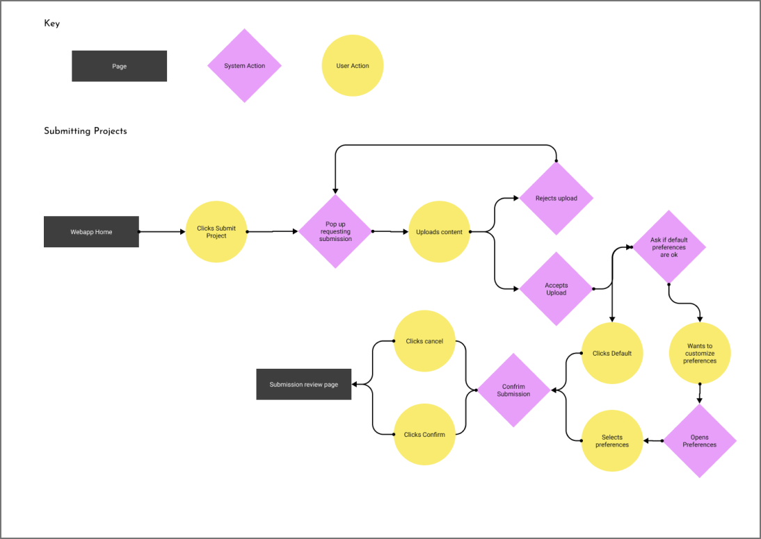 User flow of submitting a project
Forgotten Users
In a longer timeline, I would have wanted to explore more use cases for the project. There are 3 main users that would be interacting with the product.
Project Submitters Feedback Givers Team BuildersI didn’t properly get to do research on these 2 types of users and this project focuses heavily on project submitters. This is definitely something to research in future iteriations.
Major Problems
Based off of our research, we were concerned about the viability of our product. Critiquing others is something that doesn’t come naturally to people. At the same time, some people don’t even want to be critiqued.
The problem we’ve experienced among artists is that they value feedback from verifiable experience.
“... it's like, pretty annoying when randos on twitter think they can lecture me on art”.
Real quote from user interviewsRunning a design workshop
I gathered 4 designers to discuss ideas on how to incentivize feedback. We did a brainstorming session that was pretty light hearted. The loose environment helped cultivate out-of-the-box ideas. Some were more feasible than others and we proceeded with dot voting.
Dot voting helped focus in on ideas that were more realistic like offering an ad free experience in exchange for feedback. A solution we liked was offering prizes to top-rated feedback.
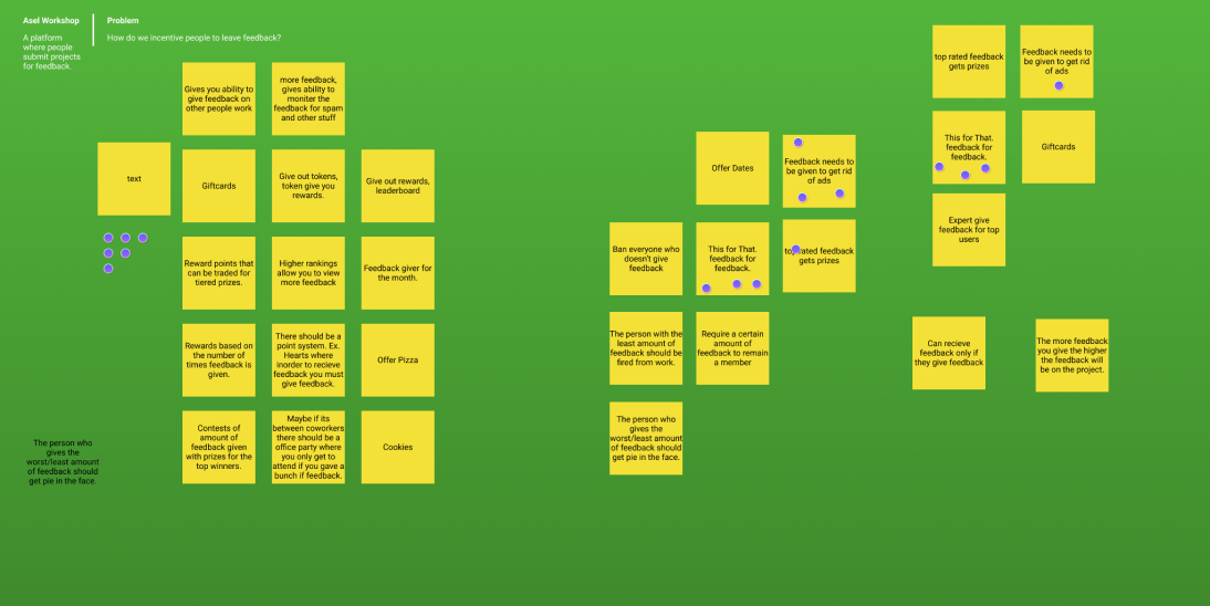 Design workshop to solve for incentives for feedback
Solution
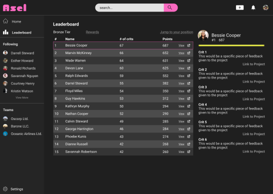
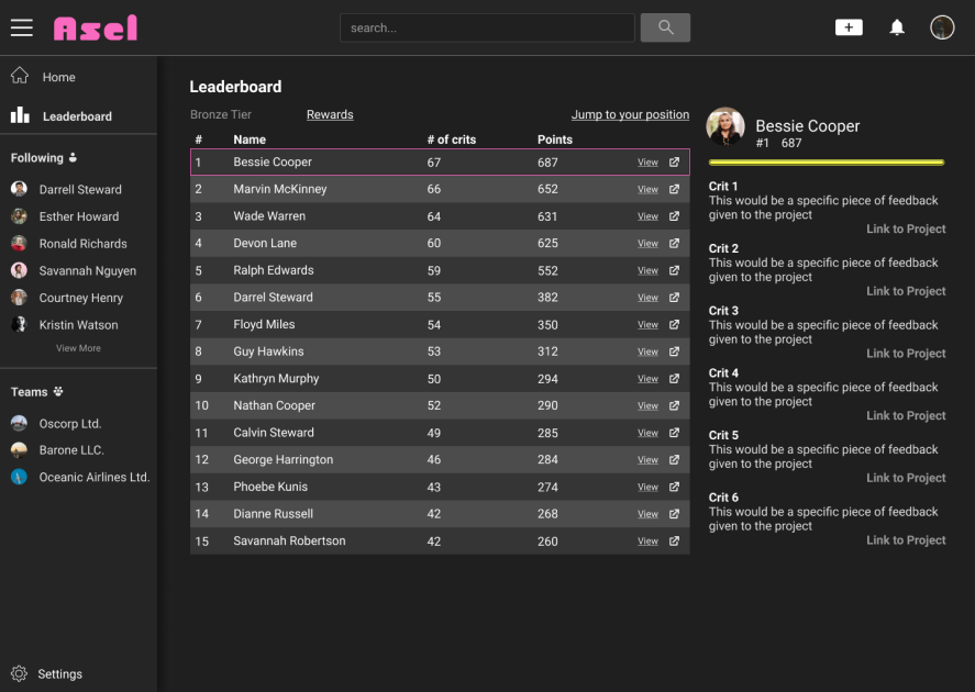
The workshop lead us towards the direction of gamification. We planned to incentivize participation by offering rewards.
Rewards include feedback from a professional and promoted posts. These two rewards directly address the issue of a reliable source and lack of feedback. Smaller rewards would be given out to pull into the gamified loop.
The thought was to distribute points for every interaction on the site. More points would be offered for critiques and positively received critiques would offer even more points.
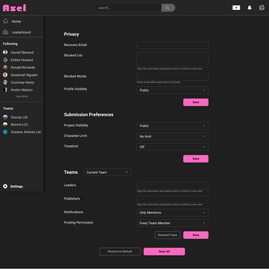
Adding a leaderboard was also discussed to cultivate competition. The leaderboard would also determine what prizes are given out to which individuals. Different teirs of the leaderboard determines what prizes are rewarded. Position on the leaderboard determines if those prizes are given.
Paper sketches
The beginning of our ideation process we were still unclear on how we wanted the site to look. We bounced ideas around on a zoom and created a few paper sketches.
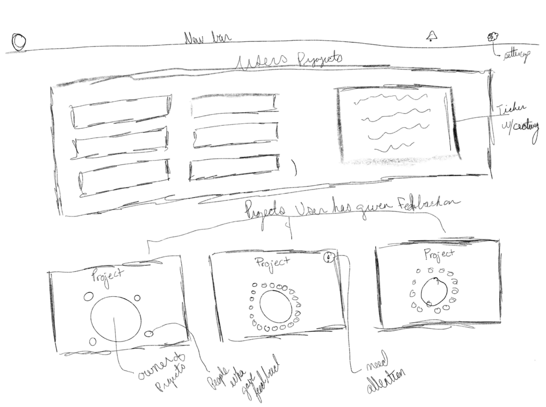
Project focused concept
Our first concept revolved around keeping the site project based. Our users would have a general overview of their projects and could at a glance see who contributed to what project.
We discussed about our research and felt that this concept didn’t address enough of our users pain points. It focused heavily on the community aspect of building a project but lacked solutions to providing confidence in feedback.
The visual layout of this sketch was something we liked and pushed through to our future lo-fi designs.
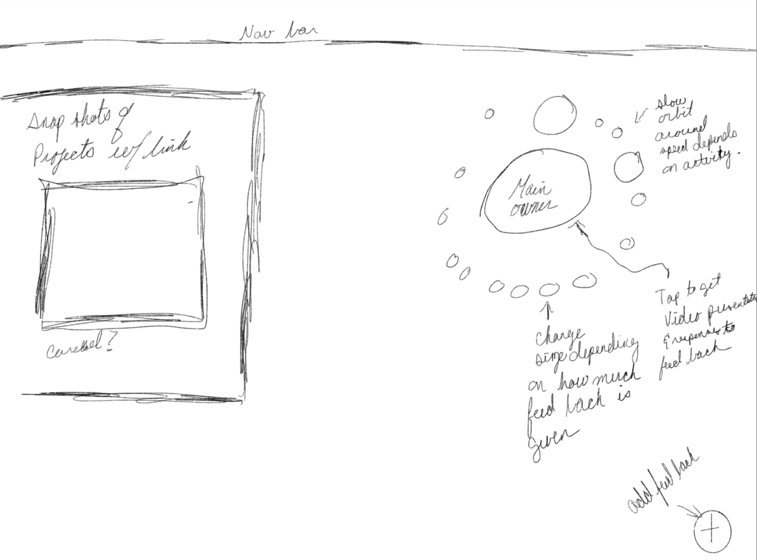
Addressing the source problem
This concept was a direct result of our thinking. Variable circles would represent individuals who contributed more to the project. This idea was attempting to tackle the issue of quality of feedback. The more an individual would contribute to a circle the larger it would get.
We had the idea of a coursel users would interact with to navigate between projects. This idea also had a similar visual layout with projects and a more in-depth view shown side-to-side.
Transitioning into wireframes
Summarizing these sketches into a concrete list of ideas was helpful for the beginning of our lo-fi process.
The circle concept was abandoned even before we jumped into our wireframes. We felt that this idea wouldn’t be practical for onboarding new users. There are established methods of showing interaction.
The horizontal and vertical layout ideas were things we explored in our wireframes. The concept of having 2 separate ideas shown on 1 screen seemed like a good idea to limit the number of screens the user had to navigate through.
Lo-fi Iterations
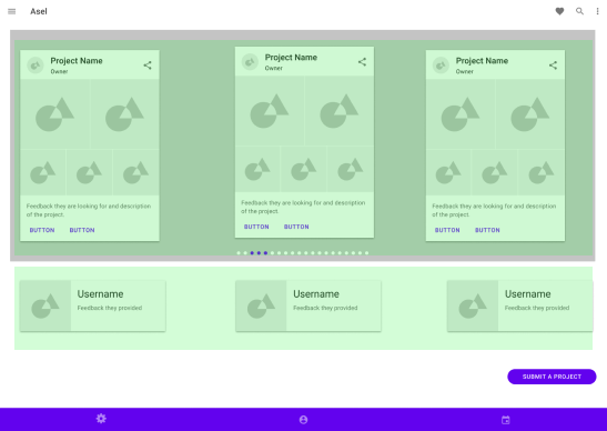
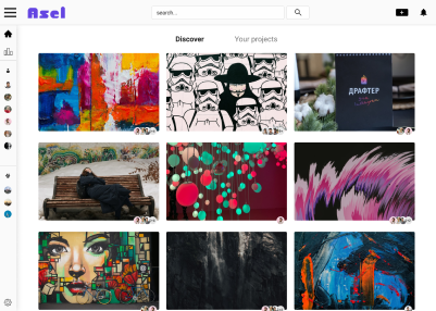
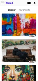
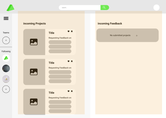 First iteration of homepage
First Iteriation Ideas
Our main objective was to have everything the user needs on the homepage.
One side would consist of projects to review, while the other side would be incoming feedback.
We had similar concepts with our previous discussion in mind.
The major deviation between our designs are the horizonal carosel and the vertical scrolling.
We discussed and landed on vertical scrolling. Our hope was that users could view a substantial amount of projects in a short time. A carosel would be more difficult to navigate between projects.
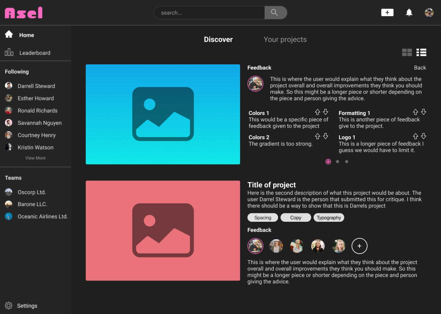
The design was too busy having 2 different views on one screen. We found that separating these views into 2 pages cleaned up the design and made it less intimidating.
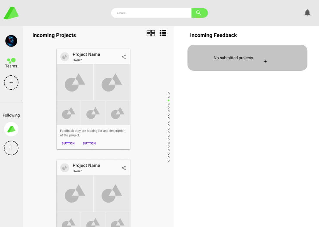
Simplification
We separated the two feeds into separate pages which allowed us to add more gamification elements.
The crown was an idea we had to distinguish members that frequently gave valuable feedback.
Even with these changes we still found that the page would be difficult to read. To help guide the user through the flow we implemented an idea of a tutorial for the site.
Testing Prototype
We felt our product warranted a tutorial. After desiging it, we tested it and everyone choose to skip the tutorial.
Without this testing we would have spent an inordinate amount of time trying to create this feature no one wanted.
 Tutorial guide for the homepage
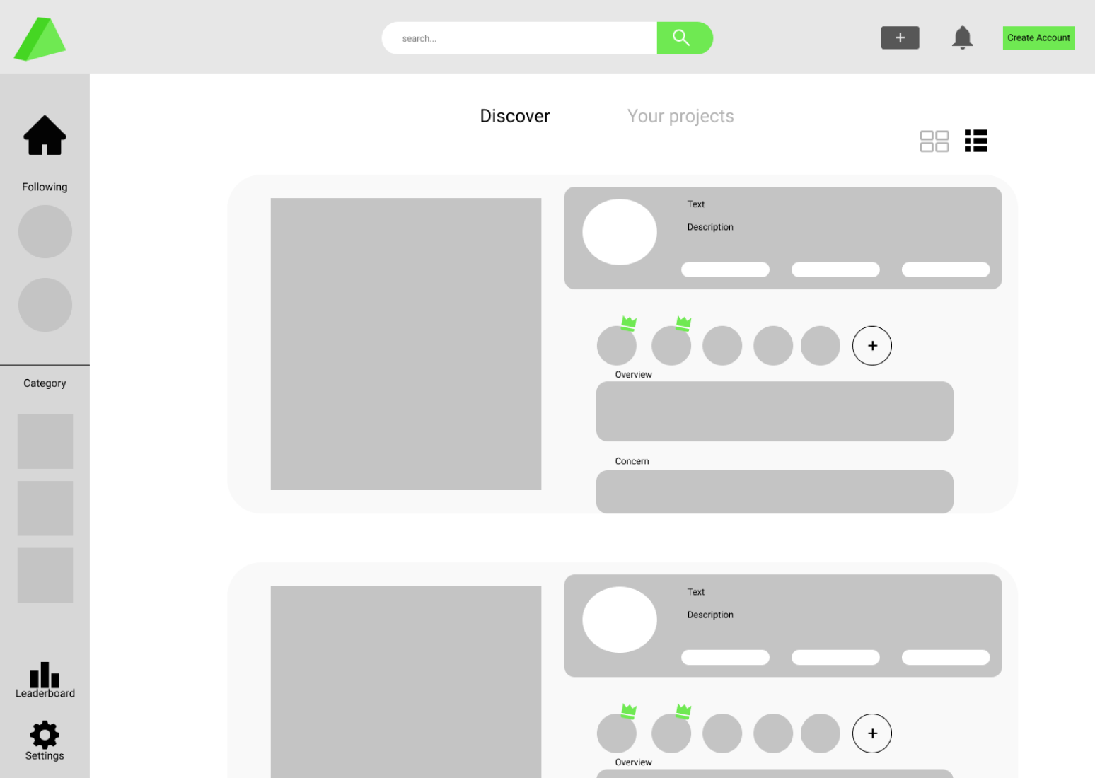
Mid to High Fidelity
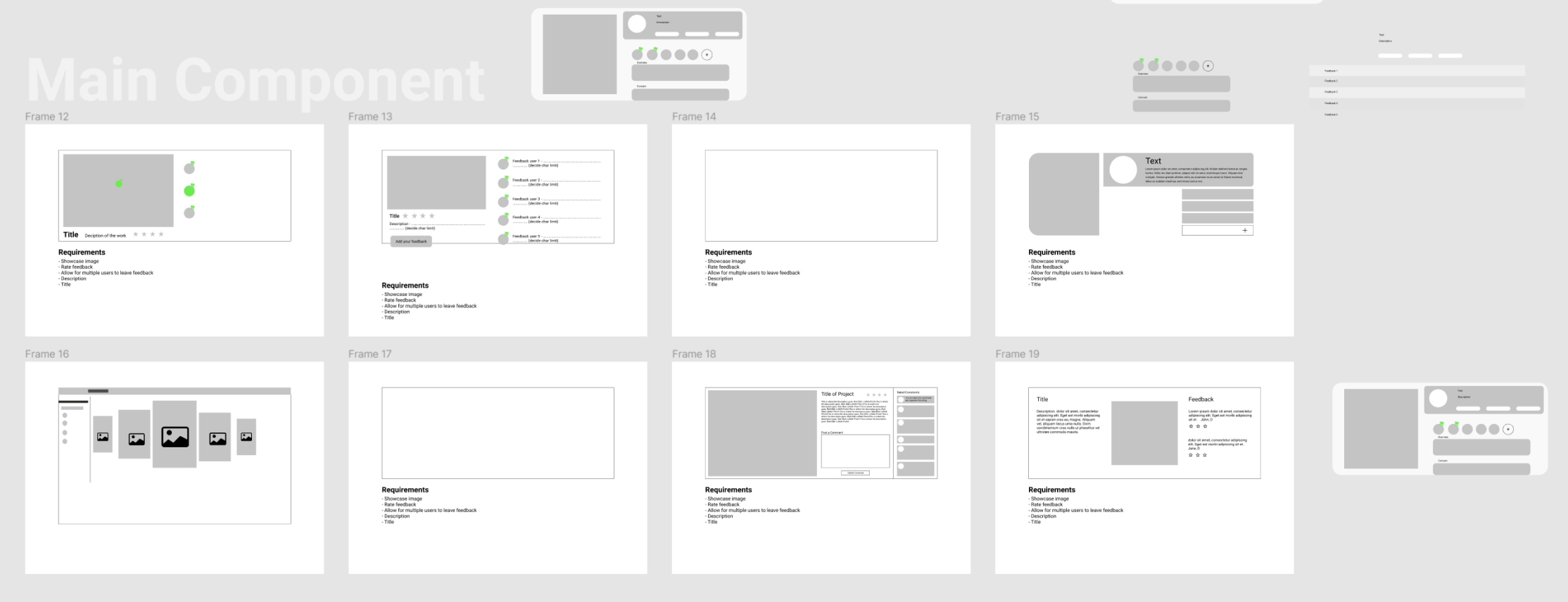
Main component group iteration
I asked a few other designers to help with simplifying the main component. This image was the one that was closest to what I was looking for.
There was a fundamental issue with the concept of trying to fit all the information on one screen.
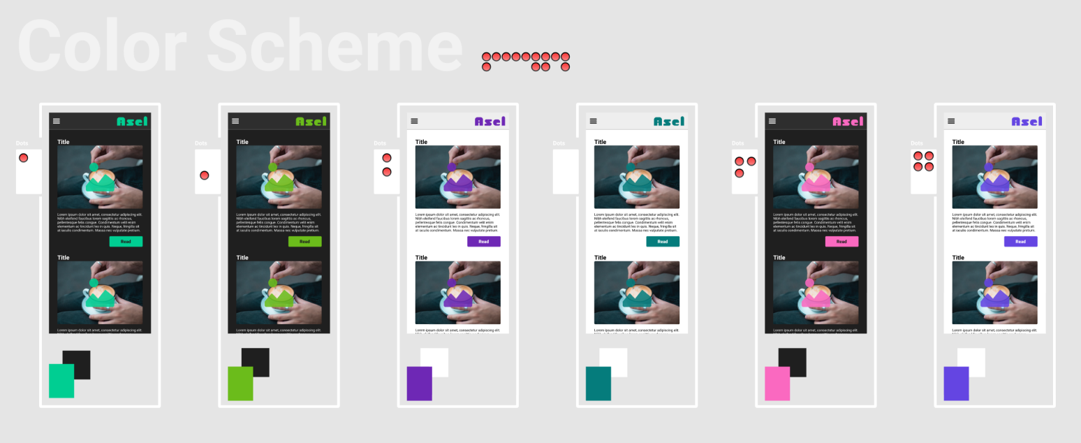
Main color scheme
I was trying to figure out the main primary color for the product. I choose these colors specifically because of their attachment to highlighters.
They all also pass contrast AA compliance and most pass AAA.
Implementing gamification
I wanted to explore the concept of gamification in this project. I knew that making people leave feedback would be a challenge. Gamification elements like the leaderboard and points system were added to push people to leave critiques.
The reward system was also attached to the leaderboard. Each tier on the leaderboard would unlock a specific reward that we learned people wanted during our user interviews.
- Points System
- 5 points per critique
- 1 point per upvote on a critique
- Rewards
- Profile customization
- Boosted post
- Feedback from a professional
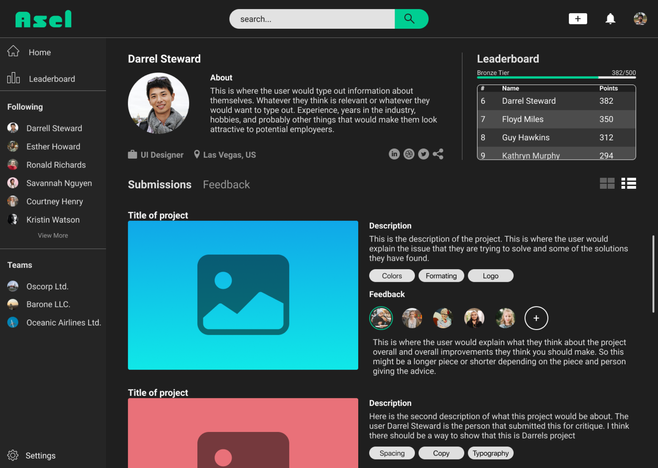
Changes to Hi-Fi
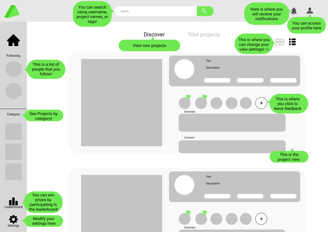
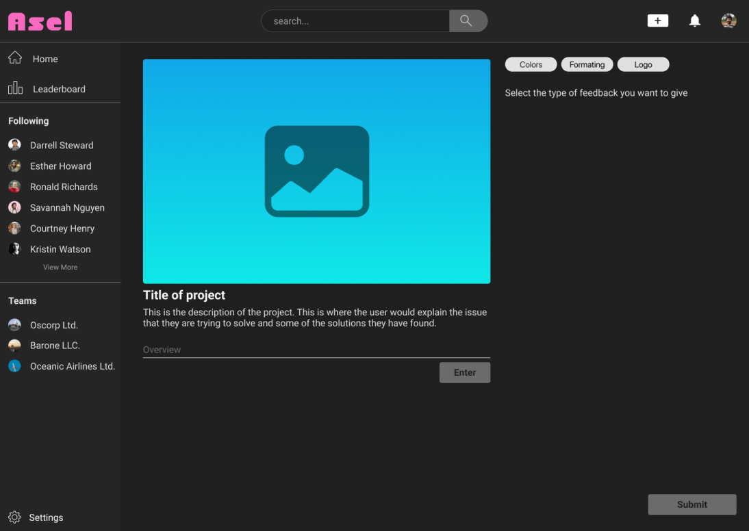
Changes from mid-fi to hi-fi included moving the title to right side to allow for more space for the project to be seen.
I changed the search bar to match the rest of the dark aesthetic in the design.
The side bar had a lot of iterations and experimentation with icons, logos, buttons, scroll bars. I landed on this for the time being.
After these changes I was hitting close to the deadline. I wanted to make sure that there were no major usability issues. I developed a Hi-Fi prototype and looked for participants for testing.
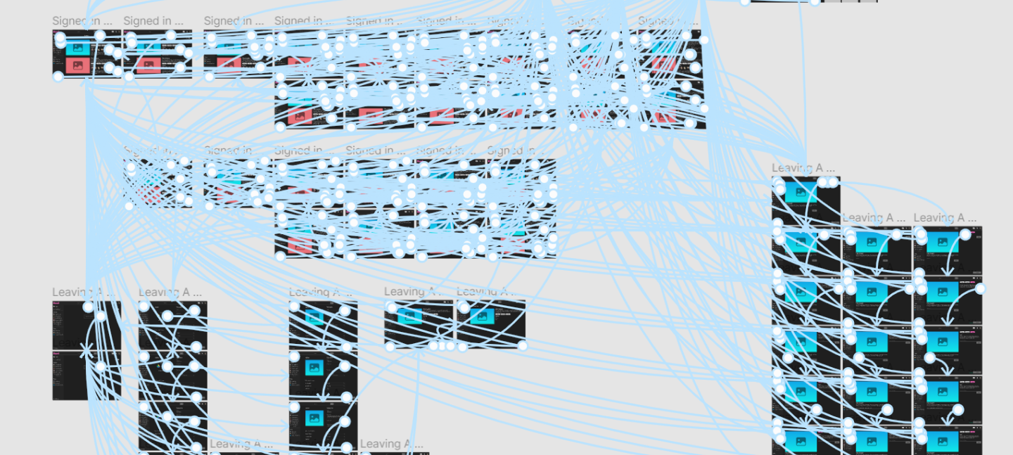
Testing prototype
The testing faired better than I anticipated. The home screen was still a troubled issue with the component.
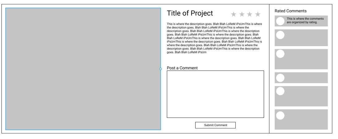
Submitting feedback is a big issue with all our participants unclear of how they were supposed to complete the task. Watching the participant seemed like the issue was with the split screen design. They expected all of their actions to take place on the left side of the page and didn’t even look at the right side. Going forward the changes to make would be to move all the interactable elements to the left side of the screen. There could also be a version with the feedback form taking up the entire screen.
I was able to complete a few changes before the deadline but wasn’t able to address every issue found during testing.
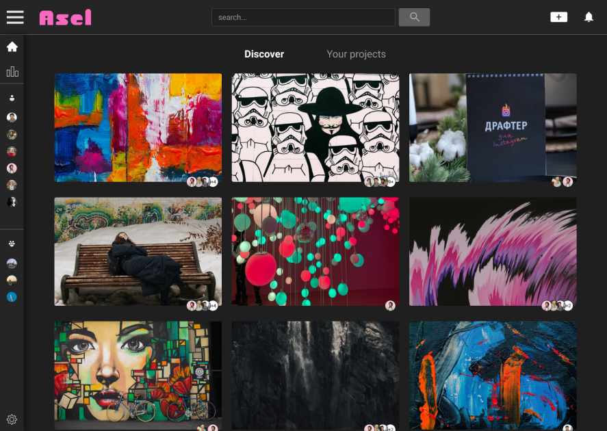
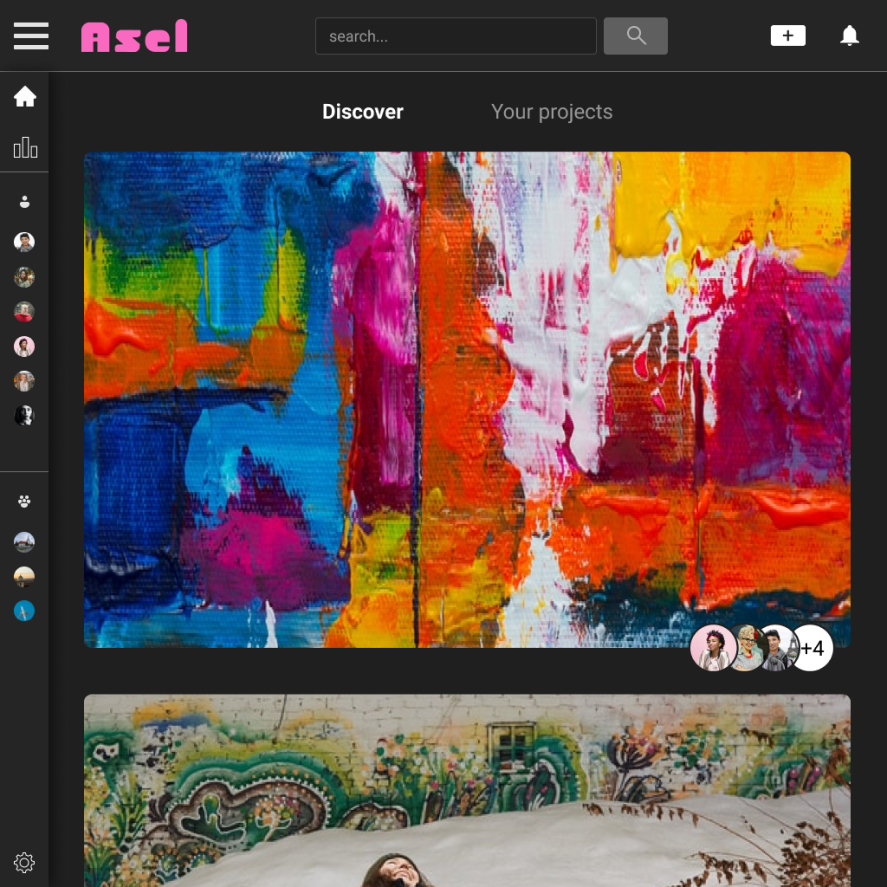
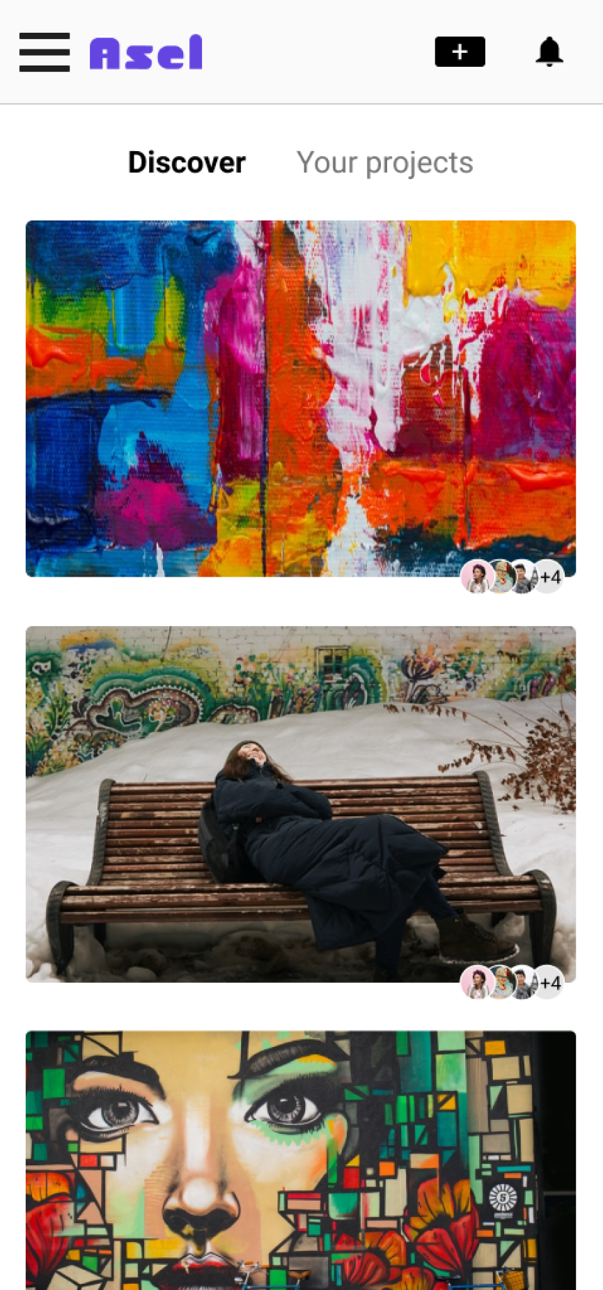
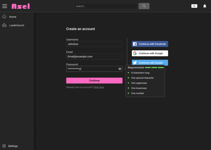
Final Designs
Retrospective
This was my first big project. There was a lot of steps that my partner and I had taken without fully understanding the purpose behind it.
Our research lacked focus. The implementation of the qualatative and quanatative feedback was poor. Onboarding our users was something we spent a lot of time and discusson on and didn’t do much to help make that process better.
All in all, I made plenty of mistakes and I learned so much. I feel like I can come back to this project and make it really solid. I do think this idea is a really good one.
I dove into gamification and while the implementation of it was not fully thought out in this project, I learned so much theory and what challenges lie when trying to implement it.